2 Part Illustration

Size
Illustration (Color Pencil) March 2022 |

Size
Illustration (Color Pencil) March 2022 |
Exhibition text
This piece is a two-part piece including a positive perspective and a negative perspective. Both pieces were made on illustration board and color pencils. The positive is called city nightlife which represents what an evening in a downtown city area would look like. The negative piece is called rainy city day represents what it would look like on a rainy day in the city. Most people are in cars because we have become a car-centric city contributing to pollution and carbon emissions. I wanted that negative perspective to focus on those aspects more. This piece was influenced by Gustave Caillebotte's Paris Street rainy day. I wanted to create my own contemporary and local version.
Inspiration
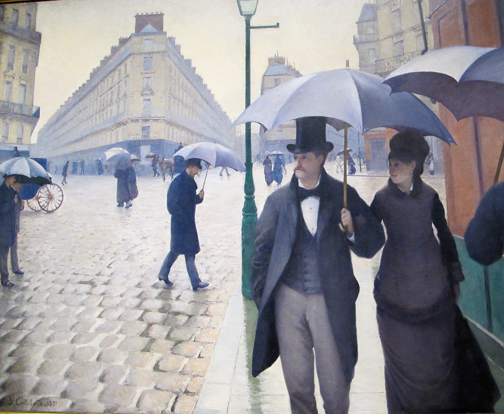
Paris Street Rainy Day 1877

The art piece I used to inspire my illustration was Paris Street; Rainy Day by Gustave Caillebotte created in 1877. This painting represents urban Paris during the 19th century: no cars, no technology, no uber just your feet. I chose this piece because beforehand I already knew I wanted to do something where I could show what it would look like today incorporating technology. I did this with both A positive perspective of technology and a negative while trying to keep the same base/ starting point. The piece was somewhat of the foundation and I decided to build off of it while keeping key elements that connect them.
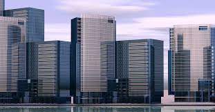
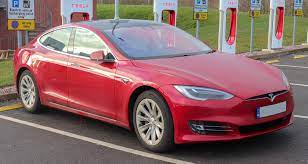
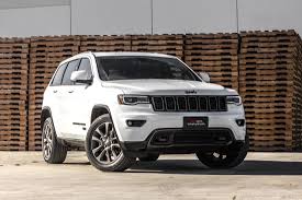
Now that I have a piece I needed to figure out what I wanted to incorporate within that piece to make it a modern version. Cars are mandatory in the inspiration. We can see that everyone is walking and it focuses on a time period where cars were not used. In today’s society it is very rare for someone to not use some form of motor transportation where it’s a car, bus, or motorcycle. I found a couple of images of modern vehicles that I would like to use that style/body of in my version of my inspiration. Next were buildings. In the inspiration, there are buildings all around in order to make them look like something from today’s time. I research buildings in cities to have an accurate depiction of what a building and 2022 would look like.
|
|

Planning

Before I began experimenting or creating the two final illustrations I decided to make a game plane. I created a chart of what I wanted or aimed to include in the positive and negative peace the these are all just brainstorms and not finalized ideas but this helped me come up with more ideas on what exactly I wanted to do. It also helped me picture. I also practiced sketching some of the designs I wanted to include like the style of cars and buildings so that I don't have to do trial and area on my final. My ideas of what i included and how i included it did end up slightly changing when i began the project as seen in the process.

After I wrote and sketched out some of the things I may include in the final piece I tested out the colors I wanted to use. I ended up kind of disregarding this whole pallet I made because I didn't want to use too many similar colors. I thought it wouldn't look like a different object and everything would look the same if I did so. The cooler colors were going to be used in the negative version while warm colors were going to be used in the positive to reflect the way we as people associate color with mood/emotion.
Process

To begin with, I created a light sketch in case I needed to erase or change anything. Like my inspiration, I created a similar setup of a modern version of what a city or downtown area would look like. This is going to be my positive connotation so I want to include more activity-focused. I decided to make two people take a selfie something that nobody would be doing in my inspirations time period. Since this is a positive containment I decided not to include rain as my inspiration but I will in the negative depiction.
|

Now i began to add fruther deatils and some of the smaller aspects withing the city. I wasn't sure on how i wnate dthe face to look so i didn't draw anythign in. I think im gonna trtake inspration from
|

Here I began to add more detail on the side building and wanted them to look like. I decided on a brick building peace even in downtown Milwaukee many of the buildings are older while there are also new ones too. I just wanted to make it more realistic and resemble what an actual part of the city may look like.
|

Here I began to add color. I started with the side buildings. I mainly use steel gray because I felt that was very modern and I used a blue-gray for the windows. Although my inspiration created a rainy day in Paris I wanted to do a sunny day because this would be more positive as most people don't like rain as I decided that could be included in the negative. |

This is the almost complete version. This is where I reflected on what I could add and what I needed to change. I think I'm gonna change the blue car because I really don't like how I made it. I decided to add masks on people because that is now a social norm in 2022 and I felt it wouldn't be right if I didn't. Along with fast-food restaurants, electric scooter, and car-centric streets because I felt there are many aspects that are included in today's time. |

This is the final piece for the positive connotation. I tried to keep it as detailed as possible within the medium of color pencil. Also, I tried to stay away from harsh outlining and attempted to blend the color so it doesn't look outlined and filled in but rather shaded with detail.
|

Here is my second one with a negative connotation. For this reason, I wanted to focus more on how today is such a car-centric society. Everything is developed with cars in mind, the way streets are made, businesses, everything. Cars are almost an essential part of our lives now and it's hard to do things without them. I decided I will include rain. I also think I will include a gas station to add to the car-centric idea.
|

To resemble what a bus would look like in Milwaukee I researched what it looked like to use similar colors.
|

Here is more filled in. I decided to add a gas station to show how car-centric today’s society is compared to my inspiration. This was not included in the original sketch but I figured it was too much empty space and that would be a great addition.
|

This is the final piece. It is not much different than the picture before this but I tried to focus on adding more color and detail, especially on the road. I felt it was too light originally and needed to be filled in more.
|
Compare & Contrast

|
|

|
- Similarities
- Both include a depiction of a town or city including what is relevant during that time period for example my inspiration was created in the late 1800s which is a correct depiction of that time period. Mine looks like a street you might see in a city somewhere.
- Mine focus on the interactions people have while my inspiration is what a rainy day in Paris would look like. Mine is how people's integration and technology differ from the 1800s until now.
- Differences
- The Medium used is the most different. he used oil paint to create his allowing for more smooth blending and less harsh lines. While I used color pencils allowing for a less realistic look and harder to smooth those sharp lines.
- The Color of my inspiration is very cool-toned while mine is more warm and color full. I didn't want to use only grays and blacks having everything the same color.
Reflection
To create the final pieces I used an illustration board and colored pencils. The challenge I faced with this project was trying to get a smoothie look which was hard with the color pencils. It was hard to get smooth edges rather than an outline look. I wanted everything to look blended but it was hard to do. I think the positive connotation looks the best blended compared to the negative. If I were to create this again I would stick with one color palette or shade of color so that it appears more uniform/less all over the place. My inspiration was Gustave Caillebotte's. I connected with his art because I wanted to do something similar but in today's time since he was alive in the late 1800s. My favorite part was sketching everything. I personally prefer the sketch then the colored pieces. I preferred it because for me it's easier to add detail through my sketch. I want others to view this work and be able to think oh I’ve seen this street before or something similar. Even though I used aspects of my city that is very versatile, it could be anywhere.
ACT Responses
1. Clearly explain how you are able to identify the cause-effect relationship between your inspiration and its effect on your artwork?
- I am able to identify the cause-and-effect relationship of my artwork through creating a city within the can see a more modern version of what a city or town would look like now versus in Paris 1987. This is seen through modern technology, clothes, and cars.
- The overall approach the author has is painting in a realistic form and also taking photography as an inspiration.
- The generalizations and conclusions I have been able to make about people while researching my inspiration it is coming for an artist to paint environments and sceneries they are comfortable in.
4. What is the central idea or theme around your inspirational research?- The central theme around my inspiration is a cites and how they can develop of a period of time.
- While I was reading my research I made inferences about time periods. I also inferred how the information would connect with what i wanted to do for my drawing.
Works Sited
“Gustave Caillebotte | Biography, Art, and Facts.” Encyclopedia Britannica, 17 Feb. 2022, www.britannica.com/biography/Gustave-Caillebotte.
“Gustave Caillebotte Paintings, Bio, Ideas.” The Art Story, www.theartstory.org/artist/caillebotte-gustave. Accessed 14 Mar. 2022.
“Gustave Caillebotte Paintings, Bio, Ideas.” The Art Story, www.theartstory.org/artist/caillebotte-gustave. Accessed 14 Mar. 2022.
